When to use
Static layouts force users to map their question to predefined fields.
Example scenario: Mortgage question returns slider + amortization chart inline, not a paragraph.
Anatomy
UI pieces that make this pattern recognizable.
- Inline widgets in chat or canvas
- Interactive controls tied to live data
- Regenerate or tweak layout on follow-up
Guidance
Do
- Constrain to a vetted design system for accessibility
- Fall back to text when generation fails
Avoid
- Do not ship novel UI controls with no labels or keyboard support
Limitations
When this pattern adds friction or fails to help.
- Generated controls may fail accessibility or brand consistency
- Novel widgets require user learning on every task
- Fallback to plain text must be reliable when generation fails
Build notes
Implementation hints for engineers shipping the pattern.
- Render from schema (JSON → components) for testability
- Log generated UI version for support/debug
- Clarifying questionnaires are a constrained pre-action subtype (see Clarifying Questions)
Examples
Annotated screenshots from production products, with designer critique.
Lovable
Post-build summary card
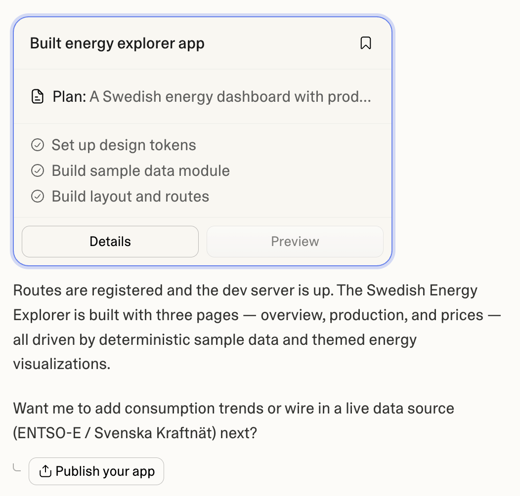
Context
After a build completes, Lovable renders a post-build summary card in the thread—Built energy explorer app with plan excerpt, checked-off steps, and Details / Preview tabs—followed by a separate Publish your app action chip beneath the agent's prose summary.
What works
- Post-build summary card scannable at a glance—title, plan, and completed steps in one block
- Details and Preview tabs keep inspection paths inside the card
- Publish your app is a distinct chip—not buried in the card or auto-triggered
What to improve
- Preview tab inactive here may confuse users expecting a live pane
- Publish chip could restate environment (preview vs production)
Takeaway: App builders should pair generative summary cards with an explicit promote action—card for what shipped, button for where it goes next.
ChatGPT
Inline weather widget
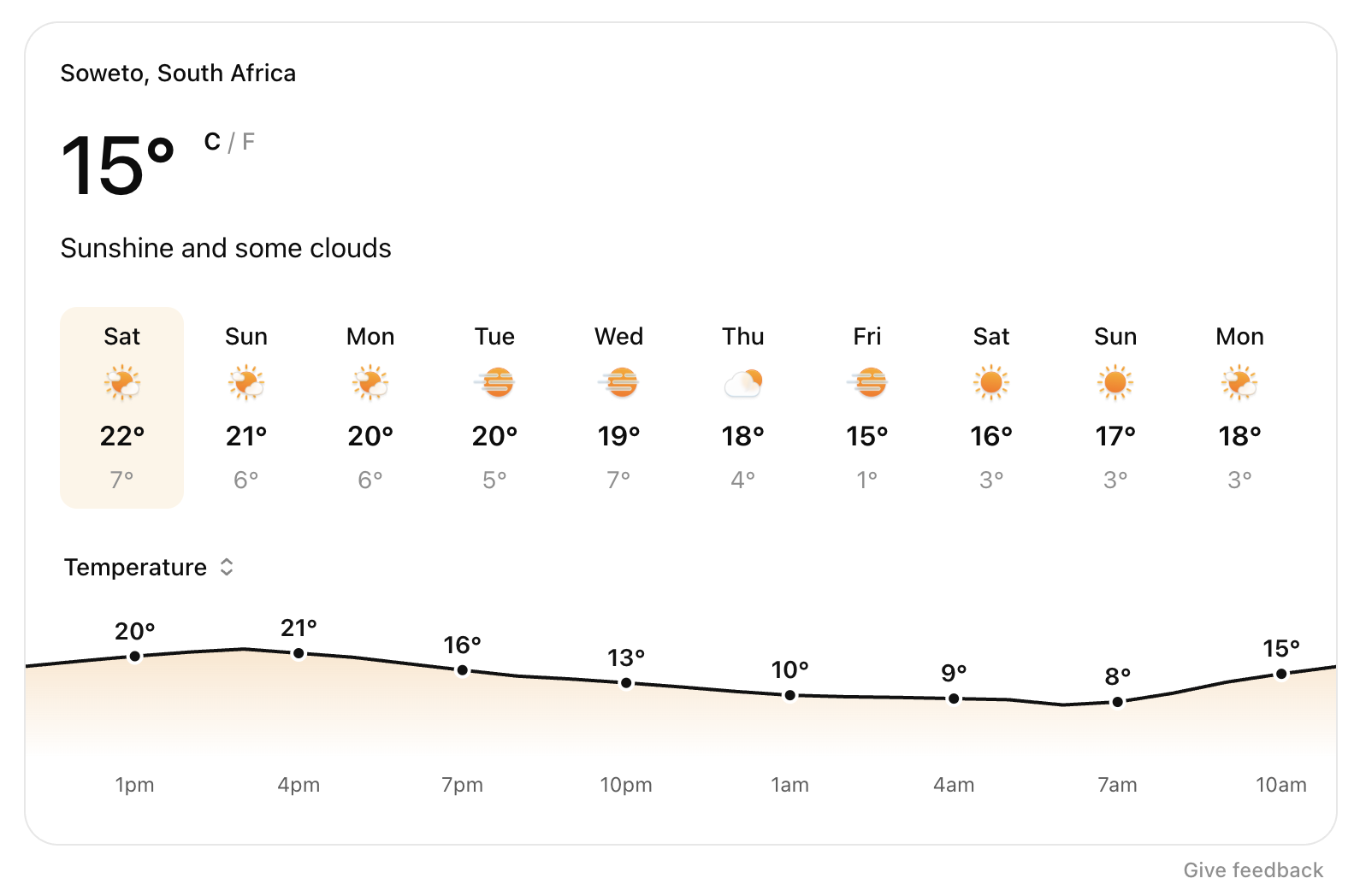
Context
For a location weather query, ChatGPT assembles a full interactive widget—current conditions, 10-day row, hourly temperature chart—inside the thread instead of a text-only forecast.
What works
- Widget matches the question shape (compare days, scan hourly trend)
- Unit toggle and chart give follow-up affordances without new prompts
- Visual hierarchy mirrors familiar weather apps
What to improve
- Accessibility of generated charts needs verification
- Widget refresh on follow-up can jump layout unexpectedly
Takeaway: Generative UI shines when the output is inherently visual—charts, maps, configurators—not prose replacements.
Gemini
Embedded map with route

Context
Gemini answers a walking-directions question with an embedded Google Maps card—route polyline, labeled pins, and map controls—generated inline rather than a link-out only.
What works
- Map is immediately inspectable without leaving chat
- Card header restates origin and destination in plain language
- Standard map affordances (zoom, fullscreen) carry over
What to improve
- Third-party embed branding can dominate the thread
- Offline or embed-blocked environments need text fallback
Takeaway: Maps and spatial answers are a strong generative-UI subtype—prefer embeds over URLs when interaction matters.
v0
Questionnaire before build
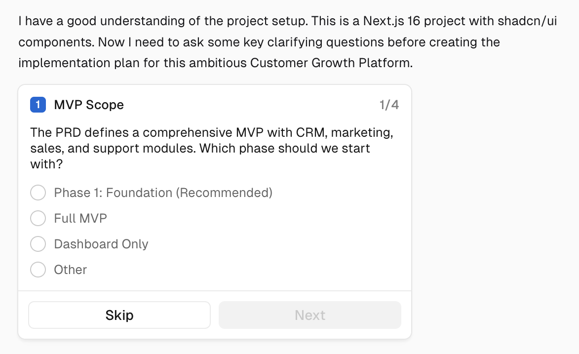
Context
v0 uses generative UI question cards—single or multi-select—to narrow product and technical choices before producing interface code.
What works
- Generative UI makes questions feel native to the task
- Card layout keeps each decision bite-sized
What to improve
- Long questionnaires block quick iterations
- Other escape hatches must stay obvious
Takeaway: Clarifying questions and generative UI combine well when each card changes the upcoming plan materially.